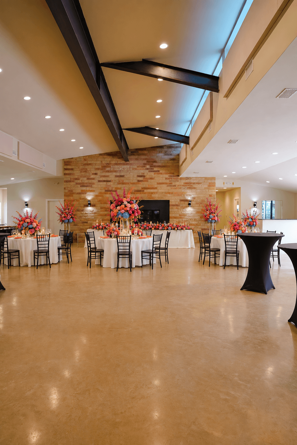
Colorful Editorial Wedding Theme: Coral, Fuchsia, Orange, and Cobalt
A colorful wedding works best when color is treated as structure, not scattered decoration. The Colorful Editorial theme combines coral, fuchsia, orange, cobalt, and lilac through bold textiles and sculptural florals, with enough neutral space to let each choice register.
Establish a color hierarchy
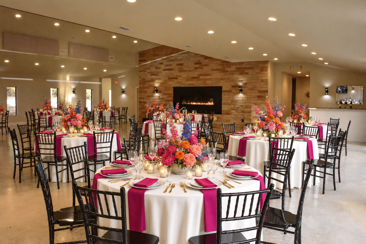
Choose two colors to lead, one or two to support, and one to appear only as a surprise. For example, coral and fuchsia might dominate the flowers, orange can warm the table, and cobalt can provide a sharp textile contrast.
Using every color at equal volume often creates visual noise. Hierarchy makes a bright palette feel designed.
Color-block larger surfaces
Instead of adding many small colorful objects, use a few confident areas: a linen group, a ceremony floral mass, a runner, or a statement bar detail. Large blocks read clearly in both the room and photographs.
Use asymmetry and sculptural form
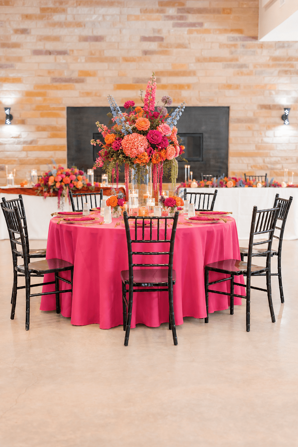
Editorial florals can feel more like art than a traditional centerpiece. Explore unusual silhouettes, negative space, and deliberate imbalance while protecting conversation sightlines and table function. Clean place settings keep the flowers from competing with too many details.
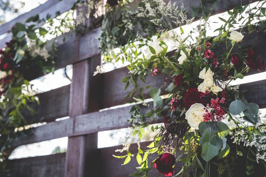
Give the ceremony a single strong composition
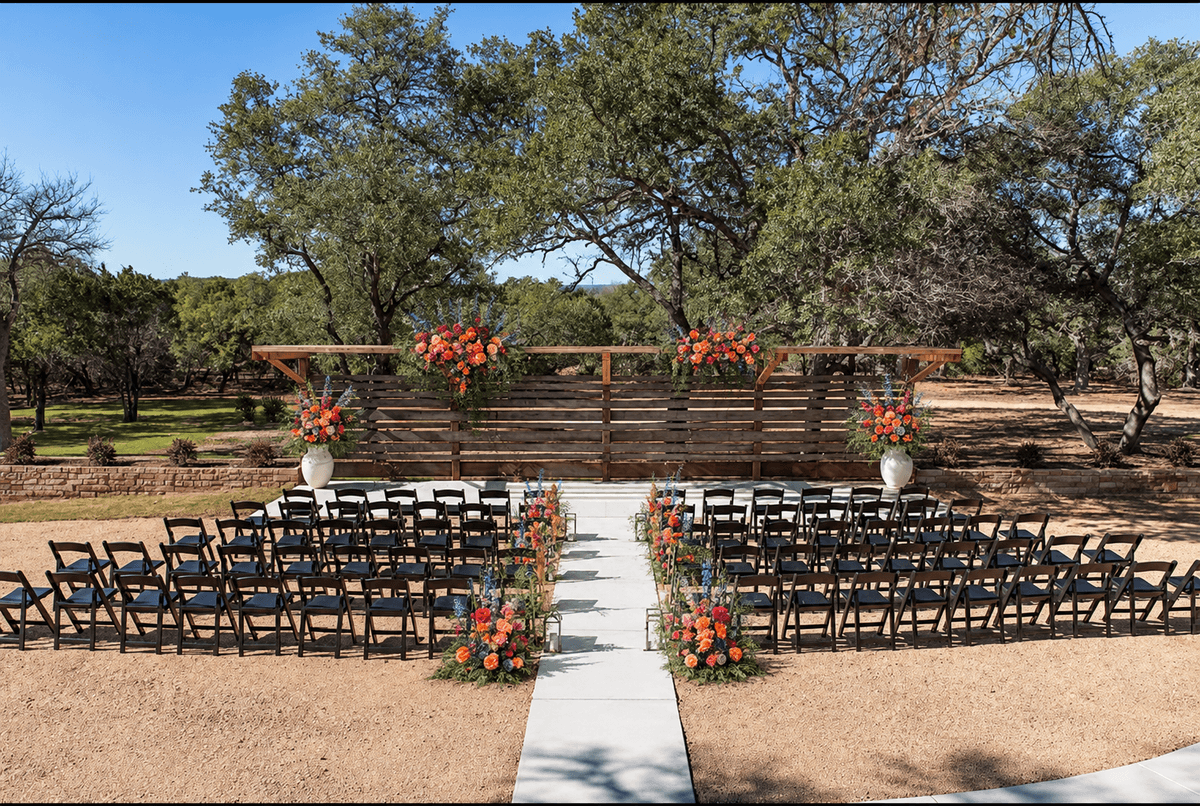
An asymmetrical floral mass can introduce the palette without lining every part of the aisle. Use the existing ceremony structure and concentrate color where it will frame the couple. Cobalt or lilac may appear in printed pieces or a small textile detail rather than competing with the landscape.
Let different spaces lead with different colors
The ceremony might emphasize coral and orange; cocktail hour can introduce cobalt; dinner may bring fuchsia and lilac forward. Repeating one color in every space creates continuity while the changing emphasis gives guests a sense of progression.
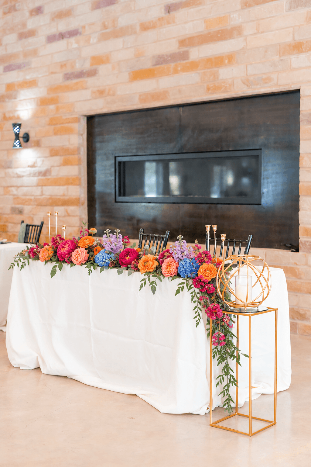
Edit the tabletop ruthlessly
When linens and flowers are bold, plates, glassware, and menus can be simpler. Decide whether the napkin, runner, or centerpiece owns the strongest color at each place setting. If all three compete, the table loses its focal point.
Order physical swatches before final approval. Coral can lean salmon or red, cobalt can photograph nearly navy, and fuchsia varies widely between flowers and fabric. Photograph samples together in daylight and reception lighting.
Connect color to the guest experience
Carry the palette into menus, signature drinks, desserts, or the transition to the dance floor. Color should help guests feel the energy of the celebration, not exist only for photographs.
Prima Vista’s neutral reception room and outdoor landscape give bold color room to stand out. Compare this look with all 12 popular 2027 wedding themes.
Browse every Colorful Editorial scene in the wedding lookbook, then test the theme alongside your practical plan in Help Me Plan.